Introducing Affirmation’s Pride Emblem: A Bold Symbol of Belonging, History & LGBTQ+ Hope

A Bold New Symbol of Belonging, History, and Hope
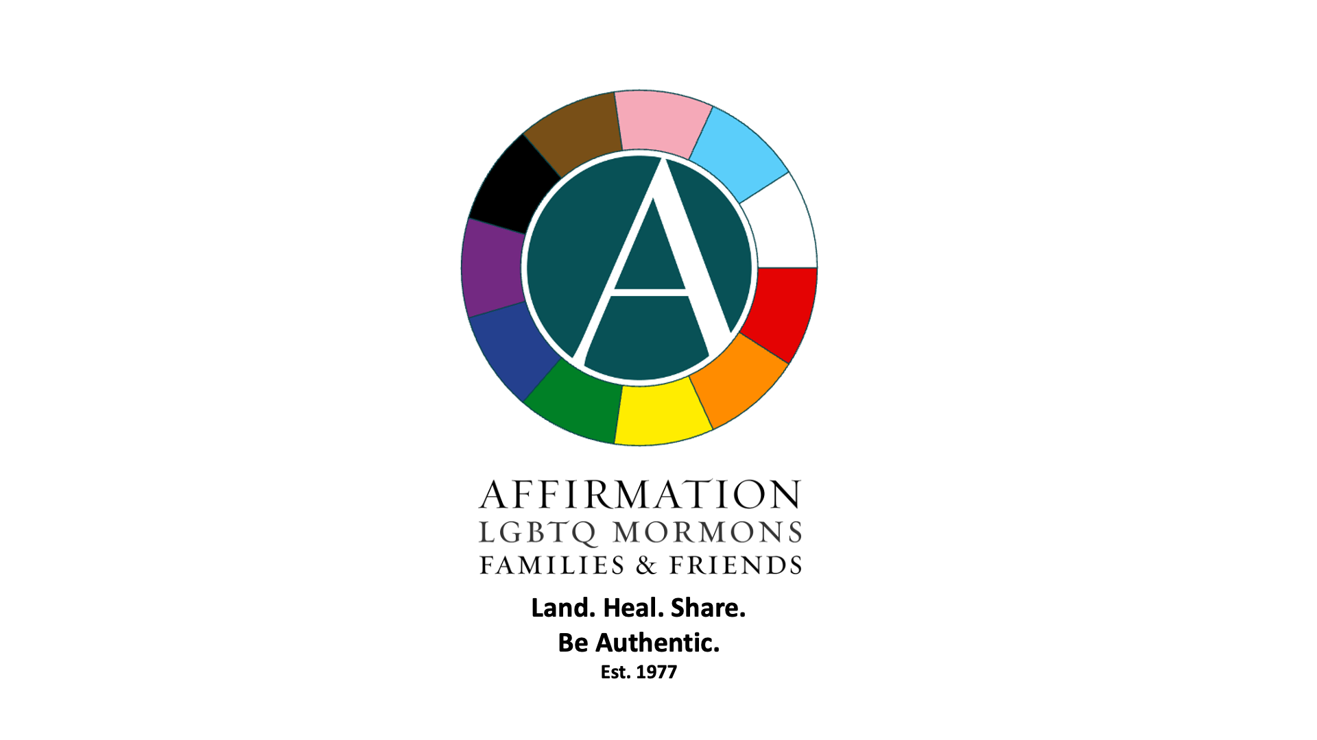
We’re thrilled to unveil a vibrant, limited-use version of the Affirmation logo—designed especially for Pride Month, LGBTQ+ History Month, and other moments when visibility matters most.
This new emblem weaves together the full spectrum of Progress Pride Flag colors with Affirmation’s iconic “A” to honor every story, every identity, and every journey in our global family.
A Logo That Speaks Across Generations
Each generation in our Affirmation community may see something different in this emblem, and that’s exactly the point.
-
For longtime members, the circle may represent the refuge, safety, and continuity that Affirmation has offered since 1977.
-
For younger generations, the Progress Pride colors symbolize the urgent need for visibility and inclusion of trans, BIPOC, and non-binary voices.
-
For all of us, it’s a reminder that we are stronger together—a movement built across generations, experiences, and expressions of faith.
This new design is not a replacement of our core logo, but a limited-use emblem for times when showing up visibly and boldly matters most.
What the Circle Represents
At the heart of the design is a circle—a form without beginning or end.
It’s more than a shape; it’s a symbol of safety, sacredness, and wholeness.
It reminds us that Affirmation is a place where all parts of you belong, without condition or exclusion.
It reflects our values of:
-
Wholeness & Unity – A community where everyone belongs, regardless of where they are on their journey.
-
Safety & Protection – A nonjudgmental refuge for those navigating faith, rejection, or crisis.
-
Continuity & History – A nod to Affirmation’s founding in 1977, and a promise to keep showing up.
-
Inclusivity & Intersectionality – A powerful visual affirmation that we embrace the full LGBTQ+ experience, especially trans, nonbinary, and BIPOC individuals.
What the Colors Represent
The new emblem features all 11 colors of the Progress Pride Flag, each carrying deep meaning:
Original Rainbow Colors
| Color | Meaning | Explanation |
|---|---|---|
| Red | Life | Honors LGBTQ+ resilience and vibrancy. |
| Orange | Healing | Uplifts restoration, emotional well-being. |
| Yellow | Sunlight | Stands for hope and joy. |
| Green | Nature | Symbolizes growth, grounding, and renewal. |
| Blue | Harmony | Celebrates peaceful, affirming community. |
| Purple | Spirit | Speaks to strength, soul, and identity. |
➕ Chevron Colors for Inclusion
| Color | Meaning | Explanation |
|---|---|---|
| Black | Marginalized Communities | Represents Black LGBTQ+ people, lives lost to HIV/AIDS and transphobic violence. |
| Brown | Intersectionality | Honors people of color and layered identity. |
| Light Blue | Transmasculine | From the traditional baby blue. |
| Pink | Transfeminine | From the traditional baby pink. |
| White | Nonbinary / Transition | Embraces nonbinary, transitioning, and fluid identities. |
When You’ll See It
This emblem will appear during:
✅ Pride Month (June)
✅ LGBTQ+ History Month (October)
✅ Trans Day of Visibility and Remembrance
Other events aligned with visibility, inclusion, and justice
For faith-based or spiritual gatherings, we’ll continue to use our core branding to maintain a sacred tone and continuity.
Why It Matters
This isn’t just a new look—it’s a reflection of who we are becoming.
It honors where we’ve been, embraces who we are now, and proudly proclaims that everyone is welcome at the table.
You are seen. You are sacred. You belong.
We Want to Hear From You
This emblem is made for all of us.
As it goes fully public, we’d love to hear what you think:
What resonates with you?
Would you feel proud seeing this at a Pride event, in print, or online?
Please share your thoughts with us at https://www.facebook.com/AffirmationLGBTMormonsFamiliesFriends
Let’s make this emblem not just symbolic, but shared, shaped, and celebrated together.
FAQ: Why did Affirmation update the logo to include Progress Pride flag colors?
Affirmation’s mission is to build communities of safety, love, and hope for all LGBTQIA+ people navigating intersections of identity, faith, and experience. Our limited-use Progress Pride emblem is part of that mission.
️ Is this replacing the rainbow flag?
No. The original six-color rainbow flag remains a powerful symbol of unity and inclusion, and we pay tribute to its legacy.
The Progress Pride design builds on that foundation by visibly including groups who have historically been marginalized within LGBTQ+ spaces:
-
Black and Brown LGBTQ+ people
-
Trans and nonbinary communities
-
Those lost to HIV/AIDS and anti-trans violence
Why highlight specific groups?
Because inclusion sometimes means amplifying voices that haven’t always been centered.
This emblem doesn’t limit love—it extends it.
What does the circle mean?
The circle around the “A” symbolizes:
-
Wholeness and continuity
-
Protection and spiritual safety
-
A place where everyone belongs—without condition or exclusion
️ Suggested talking point:
“The circle surrounding our ‘A’ is more than a shape—it’s a symbol of safety, sacredness, and wholeness. It reminds us that Affirmation is a place where all parts of you belong.”
When will this emblem be used?
This version of the logo is reserved for use during:
-
Pride Month (June)
-
LGBTQ+ History Month (October)
-
Trans Day of Visibility and similar events
It’s not replacing our core identity, but expanding it when visibility matters most.
What if someone feels left out?
We hear that concern—and we honor it.
Affirmation believes inclusion is always evolving. This emblem is a living expression, not a final definition.
We’re committed to a future where every story is seen, every person is safe, and no one walks alone.